Quick Nav
- From Webrings to Learning Oddities
- Strangeness Creates a Memory Hook
- The Productive Friction Polished Tools Remove
- When Weird Becomes Noise
- How to Use Odd Sites Without Turning Class Into Chaos
- A Small Web Assignment Worth Trying
From Webrings to Learning Oddities
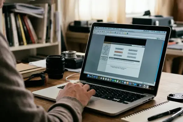
Between roughly 1995 and 2004, the educational web did not come from product teams. It came from a graphic design instructor's personal page, a museum's weekend experiment, a professor's course notes, a hobbyist's obsessive archive, and the underfunded resource page a school updated once a semester. These sat beside each other in simple link columns and webrings, tiled backgrounds behind them, visitor counters ticking at the bottom.
The look of those pages was not a style decision so much as a byproduct of who made them and how. Animated GIFs under 100 KB. Hand-labeled image maps. Left-side navigation stacked like a filing cabinet. Oddness, in other words, is a production history — the fingerprint of small hands building without a template.
That history matters because the thesis of this piece runs against the grain of most edtech thinking. Strange educational websites are memorable precisely because they force a learner to notice, interpret, and emotionally locate the lesson instead of sliding past it. The web's educational value has never been only about efficiency. It also lives in surprise, texture, and the small jolt of discovery.
A useful editorial filter for these web finds & curiosities runs on three checks. The page must teach or reveal something. The oddness must register within the first 30 to 90 seconds. And the usability problem, whatever it is, must not stop a learner from finishing a short task.
Strangeness Creates a Memory Hook
Unusual design gives the mind a concrete thing to attach a concept to. A student rarely remembers a paragraph about orbital motion. They remember the black page with a crude spinning-planet GIF that looped forever, and the moment they had to decide whether that spin meant rotation or revolution.
Three encounters that stick
Consider a hand-coded astronomy page: black background, a looping planet, three to five plain-text explanation blocks, and one comparison task — Which visual cue suggests rotation rather than revolution? Seven to twelve minutes is enough. Long enough for a learner to click, misread, correct themselves, and describe what happened. Short enough to fit inside a normal 45- to 60-minute lesson.
A virtual frog dissection is another good specimen, with its awkward menu labels — pin, cut, view organs. Ask students to name one action that changed the display and one anatomical term that got clearer afterward. The clumsiness is the point. It makes them account for what they did.
Then there is a medieval marginalia archive presented as a cabinet of curiosities. A learner picks one image, records the creature or object drawn in the margin, and infers what the page layout says about how people read. The interface feels like opening a drawer you were not supposed to open, and that feeling is a handle for the history.
None of this needs a statistic to hold up. The argument is observable in the room: the odd page is the one students describe to each other later.
The Productive Friction Polished Tools Remove
Modern platforms optimize for smoothness, completion, and standardization. That is a reasonable goal, and it makes lessons interchangeable. When every screen behaves the same way, nothing on any screen asks the learner to stop.
Older and stranger sites demand a little exploration instead. Clicking through a map. Decoding an odd menu. Testing a simulation by trial and error until a control finally does something. That small drag on attention is the mechanism behind the memory hook — the learner is not merely amused, they are slowed down in a way that requires them to look.
This connects to Robert and Elizabeth Bjork's work on desirable difficulties, applied narrowly. Friction helps only when it increases attention, retrieval, spacing, contrast, or explanation. Confusion for its own sake is not educational.
Designing light friction
Good tasks require two to four deliberate actions: click a map region, test one simulation control, compare two labels, retrieve a fact from a nonstandard menu. Keep it recoverable. A student should be able to state the task within 60 seconds, make a first meaningful click within 90, and survive a wrong click without losing the page.
For a simulation, the instruction is strict on purpose: change one variable, record the visible result in a single sentence, reset, then test a second condition. The goal is comparison, not free wandering.
Friction becomes educational only when the learner can still identify the task, recover from mistakes, and connect the odd interface choice to the concept being taught.
When Weird Becomes Noise
The counterargument deserves a straight answer, not a nostalgic dodge. Strange sites can be inaccessible, outdated, visually chaotic, factually thin, and genuinely frustrating for learners who need structure. A visually chaotic page with low contrast, dead navigation, and unsupported claims turns novelty into noise — students spend the whole lesson fighting the interface instead of forming a question.
That does not disqualify weirdness. The problem is unmanaged weirdness: oddness with no learning purpose, no accessibility check, no teacher framing. An eccentric menu can be useful. Neglect never is.
Guardrails worth keeping
- Reject any page where the main text cannot be read comfortably on a standard laptop at 100 to 125% zoom.
- Reject pages needing unsupported plug-ins, dead media embeds, or more than three failed clicks before the learner reaches the instructional object.
- Flag autoplaying sound and flashing animation as a management and accessibility risk, especially in shared rooms, libraries, and mixed-needs groups.
- Cross-check thin pages. Pair the odd site with a textbook paragraph, a museum-style explainer, a primary-source excerpt, or a teacher-made correction sheet.
Important: the same page behaves differently depending on the room. A strange site may work beautifully as a 10-minute hook in a humanities seminar, a library session, or a science demo, yet need screenshots, captions, or a teacher-built path for younger learners and accessibility-sensitive groups.
How to Use Odd Sites Without Turning Class Into Chaos
"Go explore this site" is where strange-site lessons collapse. The selection sequence has to run in order: concept first, then interface, then task. If a page fails the concept test, its charm is irrelevant.
A selection method
- Choose one page, not a whole site, for a first attempt. Hand out a direct URL plus a backup screenshot or saved excerpt in case the page shifts under you.
- Budget a 15- to 20-minute block: two minutes for setup, six to nine on the site, four to six for comparison or discussion, three for a written reflection.
- Assign a mission with a single deliverable — one surprising fact, one design choice, one comparison with a course source, or one explanation of how the interaction teaches the idea.
A mission beats an invitation. "Find one surprising fact" gives a learner somewhere to stand. "Explore this" gives them a blank room and a ticking clock.
Bottom Line: a strange educational website works best when the weird part is tied to the learning goal.
Field Note: pair the odd site with a short reflection prompt so the memorable moment becomes a retrievable idea rather than a one-time laugh.
A Small Web Assignment Worth Trying
The claim here is practical, not merely fond, so it ends with something buildable. The structure fits inside a single 20- to 25-minute activity and a teacher, librarian, or workshop leader can run it with almost no preparation.
Three parts, no more. One carefully chosen page. One guiding question: What did this page make you do that a textbook paragraph would not, and how did that action change what you understood? One reflection prompt: Name the oddest part of the site, then explain the concept it helped you remember in two or three sentences.
Picture a school librarian supervising a ninth-grade research period. Across the room a student pauses at an awkward interactive astronomy page, laughs at the spinning graphic, jabs a finger at the looping planet — and explains axial rotation by pointing at the loop instead of reciting the worksheet. The librarian says nothing. The novelty was never the lesson. The student used it as a handle, and the concept came up in their hand.