Quick Nav
- When an Everyday Player Belonged to Its Listener
- The Play Button on a 275 × 116 Canvas
- From Preview Image to a Shared Favorite
- Picking an Accent Color Versus Redrawing the Controls
- Strange Palettes Over Recognizable Playback
- Sketching a Skinnable Desktop Player
- Release One Editable Skin With the Default
When an Everyday Player Belonged to Its Listener
A tool used every day accumulates a kind of tenancy. When its owner can reshape how it looks, the tool becomes a small site of authorship; when its appearance is sealed, that opportunity quietly disappears. I value a utility differently when I am allowed to help decide its face, and the making and trading of Winamp skins between roughly 2004 and 2006 is the clearest lens I know for that difference. The claim here concerns expressive control, and it makes no ranking of software quality. Its foundation is a concrete distinction: redrawing the artwork of a playback control is a different act from selecting that control's accent color.
The first act is authorship. The second is preference.
The Play Button on a 275 × 116 Canvas
The classic main player window measures 275 × 116 pixels. That bounded canvas makes every small decision consequential, and it is the reason this essay restricts itself to classic bitmap skins rather than the later, more elaborate skinning systems that followed.
A classic skin divides the interface into named bitmap files. main.bmp holds the main panel, cbuttons.bmp holds the transport-button artwork, eqmain.bmp draws the equalizer, and pledit.bmp governs the playlist. These are related surfaces, and a coherent skin treats them as one visual family. The volume slider deserves equal attention: its track and handle are tiny, and the two must remain distinguishable from each other.
Consider a representative edit. The designer opens the transport artwork, deepens the play button's bevel, adds a highlight along its upper edge, loads the skin, and inspects both the normal and pressed states at actual display size. Here the characteristic failure appears. A convincing brushed-metal bevel, crisp in the enlarged editing view, can swallow the play triangle once the bitmap returns to its native panel. The remedy is to revise the triangle's contrast against the simulated metal until the symbol reads at a glance.
The sense of tactility in these skins came entirely from pictures: highlights, cast shadows, faux metal, and a pressed-state image that appeared to sink. Nothing moved physically. The illusion depended on artwork that the user, not the vendor, could redraw.
Check At Native Size
Inspect every control at 1:1 scale as well as zoomed in. A bevel that looks sculpted at eight times magnification can collapse into an indistinct edge at its intended size.
From Preview Image to a Shared Favorite
A skin traveled through a recognizable sequence. A listener encountered a preview image, downloaded the package, applied it during actual playback, and, if it survived ordinary use, passed it to someone else. Each stage tested something different. The preview communicated composition and mood; use revealed whether track text, sliders, and control states stayed readable.
A sensible playback trial involves three checks before deciding to keep or recommend a skin: read the current-track display, move the volume slider, and open the playlist. A skin that fails any of these may still deserve a place in a collection of web finds & curiosities, but it should not become the daily player.
What made the exchange feel personal was simple. A functional file also carried someone's visual taste. Choosing from a built-in theme menu means choosing among options a vendor anticipated; downloading a stranger's skin meant borrowing a sensibility.
For a newsletter archive, the classic .wsz package is the object worth keeping. It is a ZIP-format archive containing the skin's assets, so preserving it retains far more than a screenshot does. Three records should be stored separately, because each preserves a different part of the interface's story:
- The preview image, which shows how the creator wanted the skin seen.
- The creator's description or readme, which carries intent, credit, and any license language.
- The original package, which holds the working artwork itself.
Archiving Without Permission
Keeping an original skin package for preservation does not grant permission to modify its artwork or redistribute its contents. Record whatever credit and license text the creator supplied alongside the file, and treat that text as the governing word on reuse.
Picking an Accent Color Versus Redrawing the Controls
Three questions separate a theme picker from genuine skinning: who defines the choices, what the user can alter, and whether the result travels.
An accent-color picker or a light/dark toggle offers choices inside a system the designer has already fixed. The user selects; the vocabulary of buttons, panels, and playback states stays untouched. Classic skinning inverted that arrangement. The user could replace transport-button artwork and coordinate the main panel, equalizer, and playlist palette as one composition, which amounts to authoring the visual vocabulary itself.
Portability completes the comparison. A saved preference typically lives on one installation and stays there. Exported assets and configuration, packaged so another installation can import them, become something a person can give away.
Restricted appearance settings are one contemporary design approach, chosen for real reasons: consistent controls, readable defaults, and predictable support. Plenty of current software still permits deep customization. The argument concerns what is lost when a utility chooses the restricted path by default.
Strange Palettes Over Recognizable Playback
Expressive surfaces and essential usability can coexist, provided the designer separates them deliberately. A player may look strange, even garish, while its control meaning, focus visibility, and playback state remain legible.
Three failure cases recur often enough to name. The first is a play symbol merging into its background. The second is pressed artwork that barely differs from the normal state, leaving the listener unsure whether a click registered. The third is decorative lettering that obscures what a control does. Each turns a beautiful skin into a frustrating one during the most ordinary task, which is starting and stopping music.
The design response follows from those tasks, in order. Can the listener identify the control? Can its current state be distinguished? Does keyboard focus remain visible? These are recommendations for new work; they describe no measured property of historical skins, many of which were never built with keyboard users in mind.
Beneath the customizable surface, the interaction structure should stay fixed. Changing a button's image must never change its action, and keyboard shortcuts should remain attached to the same functions whatever the artwork. A visibly named reset action should restore the default appearance without deleting the user's saved theme, so that an unreadable experiment costs nothing.
Reset Keeps Experiments Cheap
Place the reset control where an owner can find it even when their own theme has made the interface hard to read.
Sketching a Skinnable Desktop Player
A worked example clarifies the principles. Take a small desktop audio player with a proposed default panel of 360 × 160 logical pixels. That figure is a schematic design size for this sketch and reproduces no historical specification. The default contains four elements: play/pause, track information, a progress indicator, and volume. It must be readable before any customization is exposed.
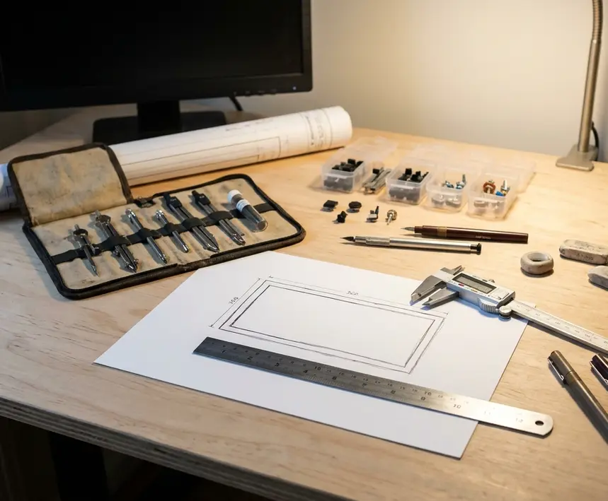
The customization surface stays deliberately manageable, with four asset groups:
- Panel colors.
- A background image.
- Button artwork.
- Normal, active, and focus-state styling.
Active appearance needs a definition per control. The play/pause control should communicate the current playback action or state. The volume control should signal interaction while the user drags it, without that styling altering the stored volume level.

The owner's path runs Appearance → Edit Local Theme → Preview → Save → Export, with Reset to Default visible throughout the appearance view. Editing begins by duplicating the default into a local theme, and the preview runs while audio continues to play, because a skin judged in silence has not really been judged. Export packages the theme's configuration together with every referenced image, so the result never depends on file paths scattered across the author's computer.
Evaluation should rest on tasks rather than taste. A finished theme passes when a listener can tell whether playback is active, change the volume, locate keyboard focus, and restore the default appearance.
Release One Editable Skin With the Default
Winamp skinning mattered because ordinary listeners could contribute to the character of a tool they opened every day. Nostalgia for those skins becomes useful only when it changes a release decision.
The minimum useful package is short: editable appearance assets, concise instructions, an in-player preview path, theme export, and a reset control. The instructions should name the panel background, transport artwork, and state styling with exactly the labels the editor uses, so nothing has to be translated between documentation and screen. The editable starter theme should begin visually identical to the default, giving its owner a known baseline against which every change can be judged. Before release, someone should import an exported theme into a separate installation and confirm that it loads without hunting for assets on the original machine.
My position is firm. The next small utility you ship should include one editable, exportable skin built from its own default, and that skin should come before any additional pack of designer presets. Presets offer more choices. An editable skin gives the owner the authorship that made a 275 × 116-pixel player feel like theirs.